WATCH | Telkom unveils bold new logo and brand identity
Telkom CEO Serame Taukobong said the period was characterised by strained economic conditions placing consumers under pressure and an intensely competitive landscape.
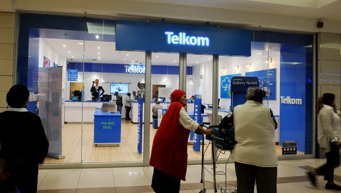
Image: Tracey Adams/Independent Newspapers
One of South Africa’s longest-standing telecoms providers Telkom,, has introduced a new brand identity and updated ‘T’ logo aimed at modernisation and aligning with future growth.
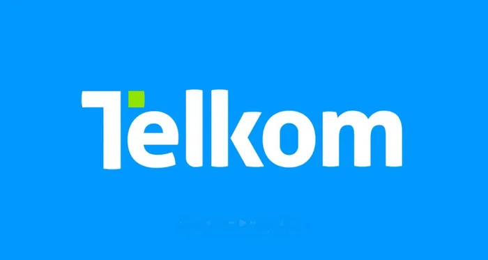
According to the company, the new ‘T’ logo shows their focus on innovation and customers, while honouring their history and looking towards the future.
"At the centre of this shift is the Dynamic T. Our Telkom ‘T’ logo is iconic and a symbol of our connectivity, reliability, and innovation," the company said.
"Our ‘T’ logo is a commitment to staying dynamic and relevant to the needs of our customers. Our new ‘T’ logo stands tall as a vibrant symbol of South Africa’s possibilities while staying true to our roots".
Last month, Telkom announced a 62.3% increase in full-year earnings and resumed paying dividends after a four-year hiatus. The company also declared a special dividend of 98 cents per share.
The company also described the newly unveiled logo as a spark of inspiration, and a journey into our future.
"We are thrilled to unveil our new brand identity. A spark of inspiration, and a journey into our future.
Telkom, one of South Africa’s longest-standing telecoms providers, has introduced a new brand identity and updated ‘T’ logo
Image: Telkom new logo / @TelkomZA / X
"It’s more than a rebrand; it’s a movement. Now, we are entering a bold new era, one that embraces all that is possible - and we’re bringing you along with us on the next part of our incredible journey".
IOL Business
mthobisi.nozulela@iol.co.za